We looked at a variety of ways in which we could focus our efforts to pull in more budding thespians. We considered leaflets, flyers, posters but none of these seemed to be a great enough outlet that we could put all our information on. We decided that the best way to reach out to a teenage generation and their parents is through the internet. We decided that a website would be the best and then anything else that the client desired we would also create. Luckily, this is exactly what our client had in mind and we were asked to create a website and a flyer that promote N2C and a leaflet for the upcoming production from N2C 'Open The Door'
Mr Chipp asked us to produce the bear bones of a website that promoted the company and let others know how to participate as an N2C member. He also asked that we create an idea for a two fliers so that post-unit we could develop the promotion of the 'Open the Door' project that N2C is starting as well as promoting N2C itself.
Target Audience: We want to attract teenagers age 14 - 20. This is because some of the work that N2C do is hard hitting and therefore the company members need to have a level of maturity and understand to develop performances with the correct attitude. We must also remember that parents will be view the website once the child is interested and therefore must not create an informal tone for sake of attractracing teenages, but maintain a professional standard to replicate the standard of the company.
Together, the four us came up with bullet points of initial idea's that would create the basics of the website, such as:
- we want the house style of the website to follow red, black, white (the same as the current N2C logo's)
- the font that is used for the logo to also be replecated throughout the website for continuity.
- use a variety of images to show the versitality and wide variety of performances the company try to acheive to percieve a unique drama company
Throughout the group we all had separate parts to focus on,
As Matt was doing the computer development (as he has the most technical ability from the four of us) we only gave him one 'tab' or 'section' of the website to initially design himself.
Emily had to focus on the 'contact us/how to join' and 'about us' section of the website. This meant retreiving the correct contact information and details from Mr Chipp to ensure all possible ways of connection were available to our audience as well as it being correct.
Chris focused on the charity tabs and the upcoming events tab, this meant he had to do research into the 'war child' charity and find out about where that support comes from.
My own job personally was to first gather all pictures for Matt so he had the variety to choose from when arranging the website. I also focused on the 'Past Productions' tab and well as the apperance for the 'Home' tab.
To design my page's, I wanted to browse various websites and see what appealed to me so I could carry these through onto our website. Our client told us he liked the 'dv8' physical theatre company website, so that was my first choice to go and pick ideas.
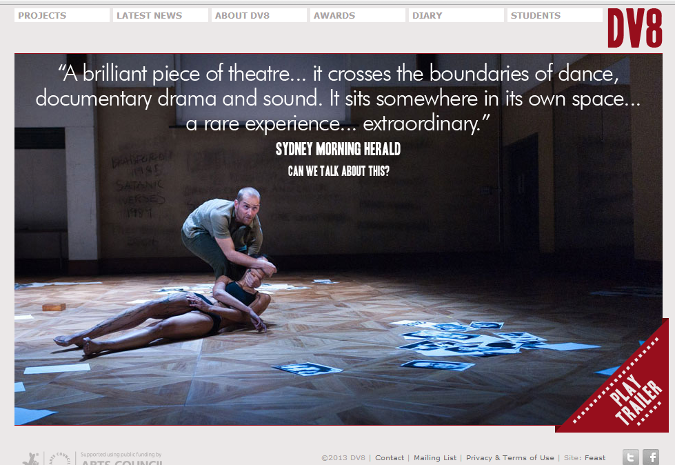
Strengths: it is very slick. Movement when clicking onto the first tab gives a professional feel to the website and the colours work well together. the tabs are visible at the top. The picture gives a good sense to the drama they associate themselves with, as well as being ambiguous making you click the trailer.
Weaknesses: although the colour scheme looks nice, could seem bland in juxtaposition to the kind of work that DV8 carry out. The name, or logo of the company isn't as established unless you previously know of the company as it's fairly small and doesn't stand out.
Opportunities: tabs allow the audience to navigate successfully and view more of the pages. Picture of engaging work will also grab the attention.
Threats: feels more like it's promoting one show than the theatre company itself.
I like the simplicity of the home page, it is actually a movement when you first go on the website and it transitions into this, although that works for this company, I think it's too advanced. I do like the quoting idea as it add's a touch of a professional and well viewed company. It is also linked to a 'trailer' which is enticing. I would like to include a video on the home page but maybe as a separate item to the pictures. There is a strong house style, which the group has already agreed to follow such as this website. We also noticed the link the twitter and facebook in the bottom corner, and thought that especially because our target audience is teenagers, that would also be a great feature to have.
I decided to type in 'drama companies' and see what the top results would be. I chose the 'Watford Palace Theatre' as they do workshops with children which has some relevance to some work that N2C do.
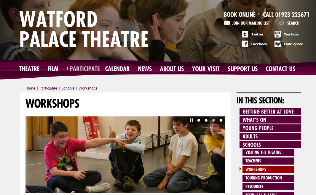
Strengths: the slideshow presents happy children which sets a positive atmosphere for the company and what it stands for and the ages it targets. The tabs are clear so it's easy to navigate around the website.
Weaknesses: there are to navigation bars, one across the top and one down the side. Although this may seem helpful, it presents the audience with more options, and personally I find this confusing and too 'busy' looking.
Opportunities: it shows a wide variety of ways to participate as a young person in an engaging way.
Threats: overcrowding of places to go/look may turn the audience away.
Threats: overcrowding of places to go/look may turn the audience away.
I like the bold use of colours, such as the contrasting red and purple, although I'm not sure that would fit with the colour scheme for N2C. I really like the slideshow idea and will work that into the home page of the website so add some movement and that way I can show the variety and versatility of the acting that N2C does from the homepage.
After the approval of all sections of the website I had the outlines for what text I needed, and I just needed to create it. The only things I did not get to discuss with Mr Chipp was which past productions he would like to be mentioned, I decided the best way to get into contact with him was via email. This is that email with Mr Chipp's reply:

After this, I decided to create the text for the sexuality but we will not input it until post-unit. I was able to focus on the text necessary for the deadline and then decided to make a computer version on publisher of my pages in order to aid Matt when designing the website. But, as a group discussion, we have told Matt that if he finds issues with creating the design we put down for him, he can edit it to something as similar as he can in order to meet the deadline with a working website. Post-unit we will continue editing the website, enhancing it to reach the full potential.
I then needed to hand in to Matt the design plan with the text that fits in where on each for the past productions tab. We had a verbal discussion with the overall idea's that I wanted and we would try and achieve the closest possible, and then develop post-unit.
No comments:
Post a Comment